- U
Excel Mapping Template for London Boroughs, and Wards
- data.ubdc.ac.uk
- data.europa.eu
xlsUpdated Nov 8, 2023 Share
Share Facebook
 Twitter
 EmailClick to copy linkLink copiedCiteGreater London Authority (2023). Excel Mapping Template for London Boroughs, and Wards [Dataset]. https://data.ubdc.ac.uk/dataset/excel-mapping-template-for-london-boroughs-and-wardsxlsAvailable download formatsDataset updatedNov 8, 2023Dataset provided byGreater London AuthorityArea coveredLondonDescription
Have you ever wanted to create a quick thematic map of London but lacked the GIS skills or software to do it yourself?
These free mapping tools from the GLA Intelligence Unit allows the user to input their own data to create an instant map that can be copied over into Word or another application of your choice. The user can also copy over the legend, and add labels.
The template allows the user to select either 4 or 5 ranges, and it even has a function to change the colours on the map (default colours are blue).
The tool now also allows users to input their own ranges, which will override the automatic ranges.
There is: Standard borough thematic map

Borough thematic map for categories (as opposed to numbers).
And ward maps for individual boroughs see list below.
Copyright notice: If you publish these maps, a copyright notice must be included within the report saying: "Contains Ordnance Survey data © Crown copyright and database rights."
Ward maps
Ward mapping tools for each borough have also been created. Select the borough you require from the list below:
All London Wards map with pre-2014 boundaries
Barking and Dagenham, Barnet, Bexley, Brent, Bromley, Camden, Croydon, Ealing, Enfield, Greenwich, Hackney (pre 2014), Hammersmith and Fulham, Haringey, Harrow, Havering, Hillingdon, Hounslow, Islington, Kensington and Chelsea (pre 2014), Kingston upon Thames, Lambeth, Lewisham, Merton, Newham, Redbridge, Richmond upon Thames, Southwark, Sutton, Tower Hamlets (pre 2014), Waltham Forest, Wandsworth, Westminster
New ward boundaries - came into effect from May 2014
All London wards map 2014 including the new ward boundaries for Hackney, Kensington and Chelsea, and Tower Hamlets following changes in May 2014.
Hackney, Kensington and Chelsea, Tower Hamlets
https://londondatastore-upload.s3.amazonaws.com/london-excel-map-thumb.JPG" alt="Alt text">
NOTE: Excel 2003 users must 'ungroup' the map for it to work.
Full instructions are contained within the spreadsheet. If you have any questions about these tools please contact Gareth Piggott.
Macros
The tool works in any version of Excel. But the user MUST ENABLE MACROS, for the features to work. There a some restrictions on functionality in the ward maps in Excel 2003 and earlier - full instructions are included in the spreadsheet.
To check whether the macros are enabled in Excel 2003 click Tools, Macro, Security and change the setting to Medium. Then you have to re-start Excel for the changes to take effect. When Excel starts up a prompt will ask if you want to enable macros - click yes.
In Excel 2007 and later, it should be set by default to the correct setting, but if it has been changed, click on the Windows Office button in the top corner, then Excel options (at the bottom), Trust Centre, Trust Centre Settings, and make sure it is set to 'Disable all macros with notification'. Then when you open the spreadsheet, a prompt labelled 'Options' will appear at the top for you to enable macros.
To create your own thematic borough maps in Excel using the ward map tool as a starting point, read these instructions. You will need to be a confident Excel user, and have access to your boundaries as a picture file from elsewhere. The mapping tools created here are all fully open access with no passwords.
- U
London Borough Profiles
- data.ubdc.ac.uk
- data.wu.ac.at
csv, unknown, xlsUpdated Nov 8, 2023ShareFacebookTwitterEmailClick to copy linkLink copiedCiteGreater London Authority (2023). London Borough Profiles [Dataset]. https://data.ubdc.ac.uk/dataset/london-borough-profilesxls, csv, unknownAvailable download formatsDataset updatedNov 8, 2023Dataset provided byGreater London AuthorityArea coveredLondonDescriptionThese profiles help paint a general picture of an area by presenting a range of headline indicator data in both spreadsheet and map form to help show statistics covering demographic, economic, social and environmental datasets for each borough, alongside relevant comparator areas.
The full datasets and more information for each of the indicators are usually available on the London Datastore. A link to each of the datasets is contained in the spreadsheet and map.

On opening the spreadsheet a simple drop down box allows you to choose which borough profile you are interested in. Selecting this will display data for that borough, plus either Inner or Outer London, London and a national comparator (usually England where data is available).
To see the full set of data for all 33 local authorities in London plus the comparator areas in Excel, click the 'Data' worksheet.
A chart and a map are also available to help visualise the data for all boroughs (macros must be enabled for the Excel map to function).
The data is set out across 11 themes covering most of the key indicators relating to demographic, economic, social and environmental data. Sources are provided in the spreadsheet. Notes about the indicator are provided in comment boxes attached to the indicator names.
Profiles using interactive mapping
For a geographical and bar chart representation of the profile data, open this interactive report. Choose indicators from the left hand side. Click on the comparators to make them appear on the chart and map.
Sources, links to data, and notes are all contained in the box in the bottom right hand corner.

These profiles include data relating to: Population, Households (census), Demographics, Migrant population, Ethnicity, Language, Employment, NEET, Benefits, Qualifications, Earnings, Volunteering, Jobs density, Business Survival, Crime, Fires, House prices, New homes, Tenure, Greenspace, Recycling, Carbon Emissions, Cars, Public Transport Accessibility (PTAL), Indices of Multiple Deprivation, GCSE results, Children looked after, Children in out-of-work families, Life Expectancy, Teenage conceptions, Happiness levels, Political control, and Election turnout.
Data is correct as of September 2014.
London Borough Atlas
To access even more data at local authority level, use the London Borough Atlas. It contains data about the same topics as the profiles but provides further detailed breakdowns and time-series data for each borough.

The London boroughs are: City of London, Barking and Dagenham, Barnet, Bexley, Brent, Bromley, Camden, Croydon, Ealing, Enfield, Greenwich, Hackney, Hammersmith and Fulham, Haringey, Harrow, Havering, Hillingdon, Hounslow, Islington, Kensington and Chelsea, Kingston upon Thames, Lambeth, Lewisham, Merton, Newham, Redbridge, Richmond upon Thames, Southwark, Sutton, Tower Hamlets, Waltham Forest, Wandsworth, Westminster.
You may also find our small area profiles useful - Ward, LSOA, and MSOA.
- a
London Boroughs
- hub.arcgis.com
- gis-tfl.opendata.arcgis.com
Updated Nov 30, 2022ShareFacebookTwitterEmailClick to copy linkLink copiedCiteTransport for London (2022). London Boroughs [Dataset]. https://hub.arcgis.com/maps/TfL::london-boroughs-1Dataset updatedNov 30, 2022Dataset authored and provided byTransport for LondonLicenseOpen Government Licence 3.0http://www.nationalarchives.gov.uk/doc/open-government-licence/version/3/
License information was derived automaticallyArea coveredDescriptionPolygon feature class of London Borough Boundaries.Last updated:28/06/17;Mastermap Alignment:N/A
London Boroughs (December 2015) Map in London
- cloud.csiss.gmu.edu
- geoportal.statistics.gov.uk
- +2more
html, pdfUpdated Dec 18, 2019+ more versionsShareFacebookTwitterEmailClick to copy linkLink copiedCiteOffice for National Statistics (2019). London Boroughs (December 2015) Map in London [Dataset]. https://cloud.csiss.gmu.edu/uddi/dataset/london-boroughs-december-2015-map-in-london3html, pdfAvailable download formatsDataset updatedDec 18, 2019Licensehttp://reference.data.gov.uk/id/open-government-licencehttp://reference.data.gov.uk/id/open-government-licence
Area coveredLondonDescriptionA PDF map of the London boroughs as at December 2015. The map shows the London boroughs split into inner London and outer London. (File Size - 225 KB).
- U
Statistical GIS Boundary Files for London
- data.ubdc.ac.uk
- data.europa.eu
- +1more
shpUpdated Nov 8, 2023+ more versionsShareFacebookTwitterEmailClick to copy linkLink copiedCiteGreater London Authority (2023). Statistical GIS Boundary Files for London [Dataset]. https://data.ubdc.ac.uk/dataset/statistical-gis-boundary-files-londonshpAvailable download formatsDataset updatedNov 8, 2023Dataset provided byGreater London AuthorityArea coveredLondonDescriptionThe Zip folder contains a range of key GIS boundary files for ESRI and Map Info covering Greater London.
The folder includes:
- Output Area (OA) 2011,
- Lower Super Output Area (LSOA) 2004 and 2011,
- Middle Super Output Area (MSOA) 2004 and 2011,
- London Wards (City of London merged into single area)
- London Boroughs
Note: The OA to MSOA boundaries have been generalised to reduce file size/loading time.
On maps created using these boundaries the copyright must be stated. This is: "Contains National Statistics data © Crown copyright and database right [2012]" and "Contains Ordnance Survey data © Crown copyright and database right [2012]"
For more information about boundary data sharing read these Terms and Conditions of Supply.
Population of London 2023, by borough
- statista.com
Updated Oct 28, 2024ShareFacebookTwitterEmailClick to copy linkLink copiedCiteStatista (2024). Population of London 2023, by borough [Dataset]. https://www.statista.com/statistics/381055/london-population-by-borough/Dataset updatedOct 28, 2024Time period covered2023Area coveredUnited KingdomDescriptionIn 2023, Croydon had the largest population among London's 32 boroughs at 397,741, while Kensington and Chelsea had the smallest population, at 147,460.
- w
London Borough Profiles and Atlas
- data.wu.ac.at
- data.europa.eu
csv, html, xls, zipUpdated Mar 15, 2018+ more versionsShareFacebookTwitterEmailClick to copy linkLink copiedCiteGreater London Authority (GLA) (2018). London Borough Profiles and Atlas [Dataset]. https://data.wu.ac.at/odso/data_gov_uk/MjQ4ZjVmMDQtMjNjZi00NDcwLTkyMTYtMGQwYmU5Yjg3N2E4xls, html, csv, zipAvailable download formatsDataset updatedMar 15, 2018Dataset provided byGreater London Authority (GLA)LicenseOpen Government Licence 3.0http://www.nationalarchives.gov.uk/doc/open-government-licence/version/3/
License information was derived automaticallyArea coveredLondonDescriptionThe London Borough Profiles help paint a general picture of an area by presenting a range of headline indicator data in both spreadsheet and map form to help show statistics covering demographic, economic, social and environmental datasets for each borough, alongside relevant comparator areas. The London Borough Atlas does the same but provides further detailed breakdowns and time-series data for each borough. The full datasets and more information for each of the indicators are usually available on the London Datastore. A link to each of the datasets is contained in the spreadsheet and map. London Borough Profiles On opening the Microsoft Excel version, a simple drop down box allows you to choose which borough profile you are interested in. Selecting this will display data for that borough, plus either Inner or Outer London, London and a national comparator (usually England where data is available). To see the full set of data for all 33 local authorities in London plus the comparator areas in Excel, click the 'Data' worksheet. A chart and a map are also available to help visualise the data for all boroughs (macros must be enabled for the Excel map to function). The data is set out across 11 themes covering most of the key indicators relating to demographic, economic, social and environmental data. Sources are provided in the spreadsheet. Notes about the indicator are provided in comment boxes attached to the indicator names. For a geographical and bar chart representation of the profile data, choose the InstantAtlas version. Choose indicators from the left hand side. Click on the comparators to make them appear on the chart and map. Sources, links to data, and notes are all contained in the box in the bottom right hand corner. These profiles include data relating to: Population, Households (census), Demographics, Migrant population, Ethnicity, Language, Employment, NEET, DWP Benefits (client group), Housing Benefit, Qualifications, Earnings, Volunteering, Jobs density, Business Survival, Crime, Fires, House prices, New homes, Tenure, Greenspace, Recycling, Carbon Emissions, Cars, Public Transport Accessibility (PTAL), Indices of Multiple Deprivation, GCSE results, Children looked after, Children in out-of-work families, Life Expectancy, Teenage conceptions, Happiness levels, Political control, and Election turnout. London Borough Atlas To access even more data at local authority level, use the London Borough Atlas. It contains data about the same topics as the profiles but provides further detailed breakdowns and time-series data for each borough. There is also an InstantAtlas version available. The London boroughs are: City of London, Barking and Dagenham, Barnet, Bexley, Brent, Bromley, Camden, Croydon, Ealing, Enfield, Greenwich, Hackney, Hammersmith and Fulham, Haringey, Harrow, Havering, Hillingdon, Hounslow, Islington, Kensington and Chelsea, Kingston upon Thames, Lambeth, Lewisham, Merton, Newham, Redbridge, Richmond upon Thames, Southwark, Sutton, Tower Hamlets, Waltham Forest, Wandsworth, Westminster. You may also find our small area profiles useful - Ward, LSOA, and MSOA.
- U
Focus on London - Population and Migration
- data.ubdc.ac.uk
- data.europa.eu
- +1more
pdf, xlsUpdated Nov 8, 2023ShareFacebookTwitterEmailClick to copy linkLink copiedCiteGreater London Authority (2023). Focus on London - Population and Migration [Dataset]. https://data.ubdc.ac.uk/dataset/focus-on-london-population-and-migrationxls, pdfAvailable download formatsDataset updatedNov 8, 2023Dataset provided byGreater London AuthorityArea coveredLondonDescriptionThis report was released in September 2010. However, recent demographic data is available on the datastore - you may find other datasets on the Datastore useful such as: GLA Population Projections, National Insurance Number Registrations of Overseas Nationals, Births by Birthplace of Mother, Births and Fertility Rates, Office for National Statistics (ONS) Population Estimates
FOCUSON**LONDON**2010:**POPULATION**AND**MIGRATION**
London is the United Kingdom’s only city region. Its population of 7.75 million is 12.5 per cent of the UK population living on just 0.6 per cent of the land area. London’s average population density is over 4,900 persons per square kilometre, this is ten times that of the second most densely populated region.
Between 2001 and 2009 London’s population grew by over 430 thousand, more than any other region, accounting for over 16 per cent of the UK increase.
This report discusses in detail the population of London including Population Age Structure, Fertility and Mortality, Internal Migration, International Migration, Population Turnover and Churn, and Demographic Projections.
Population and Migration report is the first release of the Focus on London 2010-12 series. Reports on themes such as Income, Poverty, Labour Market, Skills, Health, and Housing are also available.
REPORT:
Read the full report in PDF format.
https://londondatastore-upload.s3.amazonaws.com/fol/FocusOnLondonCoverweb.jpg" alt="">
PRESENTATION:
To access an interactive presentation about population changes in London click the link to see it on Prezi.com
DATA:
To access a spreadsheet with all the data from the Population and Migration report click on the image below.
MAP:
To enter an interactive map showing a number of indicators discussed in the Population and Migration report click on the image below.
FACTS:
● Top five boroughs for babies born per 10,000 population in 2008-09:
- Newham – 244.4
- Barking and Dagenham – 209.3
- Hackney – 205.7
- Waltham Forest – 202.7
Greenwich – 196.2
-32. Havering – 116.8
-33. City of London – 47.0
● In 2009, Barnet overtook Croydon as the most populous London borough. Prior to this Croydon had been the largest since 1966
● Population per hectare of land used for Domestic building and gardens is highest in Tower Hamlets
● In 2008-09, natural change (births minus deaths) led to 78,000 more Londoners compared with only 8,000 due to migration. read more about this or click play on the chart below to reveal how regional components of populations change have altered over time.
London Atmospheric Emissions Inventory (LAEI) 2019
- data.subak.org
pdf, zipUpdated Feb 15, 2023+ more versionsShareFacebookTwitterEmailClick to copy linkLink copiedCiteGreater London Authority (2023). London Atmospheric Emissions Inventory (LAEI) 2019 [Dataset]. https://data.subak.org/dataset/london-atmospheric-emissions-inventory-laei-2019zip, pdfAvailable download formatsDataset updatedFeb 15, 2023Area coveredLondonDescriptionThe LAEI 2019 is the latest version of the London Atmospheric Emissions Inventory and replaces previous versions of the inventory.
Emissions estimates of key pollutants (NOx, PM10, PM2.5 and CO2) by source type are included for the base year 2019. Emissions for previous years 2013 and 2016 have also been revised, using the latest data sources (emission factors, activity data, ...) where available, and changes in methodology where relevant.
Emissions projected forward to 2025 and 2030 will be available soon.
The area covered by the LAEI includes Greater London (the 32 London boroughs and the City of London), as well as areas outside Greater London up to the M25 motorway.
These emissions have been used to estimate ground level concentrations of key pollutants NOx, NO2, PM10 and PM2.5 across Greater London for year 2019, using an atmospheric dispersion model. Air pollutant concentration maps and associated datasets are available for download.
Due to the size of the LAEI database, datasets are provided in several parts and provided as ZIP files.
Documentation
- LAEI Summary Note (.PDF - 2.0 MB)
Supporting Information Key GIS geographies and road traffic flows and vehicle-kilometres for 2019 for each vehicle type. Data are provided in Excel and GIS formats.
- Supporting Information - GIS geographies (.ZIP - 2.5 MB)
- Supporting Information - Road Traffic Data - Excel (.ZIP - 22.4 MB)
- Supporting Information - Road Traffic Data - GIS (.ZIP - 9.7 MB)
Grid Emissions Summary This dataset includes emissions of key pollutants NOx, PM10, PM2.5and CO2, and a range of additional pollutants (SO2, CH4, VOC...) in tonnes/year for 2013, 2016 and 2019 for each source category at a 1km grid square resolution (further split to follow all London borough boundaries). It includes emission summary tables for London boroughs and London zones (Central / Inner / Outer London). Data are provided in Excel and GIS formats.
- Update 26 07 2022 : Please note that emission totals have been slightly revised to correct emissions for Rail and Construction NRMM Exhaust (for CO2) and Industrial / Commercial Heat and Power sources (for all pollutants). Please refer to the Emissions - Data - Excel File below for further information.
- Emissions - Data - Excel Files (.ZIP - 58.5 MB)
- Emissions - Data - GIS Files (.ZIP - 66.4 MB)
- Emissions - Summary Dashboards (.ZIP - 338 KB)
Detailed Road Transport Road transport NOx, PM10, PM2.5and CO2 emissions in 2019 by vehicle type. PM emissions include split by exhaust, break wear and tyre wear. This data is provided at link level for major roads. Data are provided in several GIS formats.
- Emissions - Detailed Road Transport - Major Roads - Geopackage GPKG (.ZIP - 157.4 MB)
- Emissions - Detailed Road Transport - Major Roads - Mapinfo TAB (.ZIP - 124.7 MB)
- Emissions - Detailed Road Transport - Major Roads - ESRI SHP (.ZIP - 142.3 MB)
Concentrations This dataset includes modelled 2019 ground level concentrations of annual mean NOx, NO2, PM10 and PM2.5in µg/m3 (microgramme per cubic metre) at 20m grid resolution. For PM10, it also includes the number of daily means exceeding 50 µg/m3. Data are provided in CSV, GIS (ESRI) and PDF formats.
- Concentrations - Data - ASCII Files (.ZIP - 132.2 MB)
- Concentrations - Data - Excel Files (.ZIP - 180.4 MB)
- Concentrations - Maps - PDF / Image Files (.ZIP - 31.0 MB).
- Concentrations - Data - GIS Files (.ZIP - 95.4 MB). Includes GIS files in ESRI format to visualise the concentrations in a GIS software (ArcGIS).
Population Exposure These datasets include estimations of the number of Londoners and number of schools, hospitals and care homes in London exposed to an annual average NO2 concentration above the Air Quality Strategy objective of 40µg/m3 and PM2.5 concentration above the interim WHO Guideline of 10µg/m3, based on the modelled 2019 ground level concentrations. A comparison with previous 2016 concentrations modelled for the LAEI 2016 inventory is also provided.
- NO2 Population Exposure (.XLSX - 62 KB)
- NO2 and PM2.5 School Exposure (.XLSX - 1.4 MB)
- NO2 and PM2.5 Hospital and Care Home Exposure (.XLSX - 37 KB)
- U
Focus on London - Income and Spending
- data.ubdc.ac.uk
- data.europa.eu
- +1more
pdf, xlsUpdated Nov 8, 2023+ more versionsShareFacebookTwitterEmailClick to copy linkLink copiedCiteGreater London Authority (2023). Focus on London - Income and Spending [Dataset]. https://data.ubdc.ac.uk/dataset/focus-on-london-income-and-spendingxls, pdfAvailable download formatsDataset updatedNov 8, 2023Dataset provided byGreater London AuthorityArea coveredLondonDescriptionFOCUSON**LONDON**2010:**INCOME**AND**SPENDING**AT**HOME**
Household income in London far exceeds that of any other region in the UK. At £900 per week, London’s gross weekly household income is 15 per cent higher than the next highest region. Despite this, the costs to each household are also higher in the capital. Londoners pay a greater amount of their income in tax and national insurance than the UK average as well as footing a higher bill for housing and everyday necessities. All of which leaves London households less well off than the headline figures suggest.
This chapter, authored by Richard Walker in the GLA Intelligence Unit, begins with an analysis of income at both individual and household level, before discussing the distribution and sources of income. This is followed by a look at wealth and borrowing and finally, focuses on expenditure including an insight to the cost of housing in London, compared with other regions in the UK.
See other reports from this Focus on London series.
REPORT:
To view the report online click on the image below. Income and Spending Report PDF
https://londondatastore-upload.s3.amazonaws.com/fol/fol10-income-cover-thumb1.png" alt="Alt text">
PRESENTATION:
This interactive presentation finds the answer to the question, who really is better off, an average London or UK household? This analysis takes into account available data from all types of income and expenditure. Click on the link to access.
The Prezi in plain text version
RANKINGS:
https://londondatastore-upload.s3.amazonaws.com/fol/fol10-income-tableau-chart-thumb.jpg" alt="Alt text">
This interactive chart shows some key borough level income and expenditure data. This chart helps show the relationships between five datasets. Users can rank each of the indicators in turn.
Borough rankings Tableau Chart
MAP:
These interactive borough maps help to geographically present a range of income and expenditure data within London.
Interactive Maps - Instant Atlas
DATA:
All the data contained within the Income and Spending at Home report as well as the data used to create the charts and maps can be accessed in this spreadsheet.
FACTS:
Some interesting facts from the data…
● Five boroughs with the highest median gross weekly pay per person in 2009:
-1. Kensington & Chelsea - £809
-2. City of London - £767
-3. Westminster - £675
-4. Wandsworth - £636
-5. Richmond - £623
-32. Brent - £439
-33. Newham - £422
● Five boroughs with the highest median weekly rent for a 2 bedroom property in October 2010:
-1. Kensington & Chelsea - £550
-2. Westminster - £500
-3. City of London - £450
-4. Camden - £375
-5. Islington - £360
-32. Havering - £183
-33. Bexley - £173
● Five boroughs with the highest percentage of households that own their home outright in 2009:
-1. Bexley – 38 per cent
-2. Havering – 36 per cent
-3. Richmond – 32 per cent
-4. Bromley – 31 per cent
-5. Barnet – 28 per cent
-31. Tower Hamlets – 9 per cent
-32. Southwark – 9 per cent
- g
홈 포털 유럽연합 데이터 London Heat Map
- gimi9.com
ShareFacebookTwitterEmailClick to copy linkLink copiedCite홈 포털 유럽연합 데이터 London Heat Map [Dataset]. https://gimi9.com/dataset/eu_london-heat-mapArea coveredLondonDescriptionThe London Heat Map is a tool designed to help you identify areas of high heat demand, explore opportunities for new and expanding district heat networks and to draw potential heat networks and assess their financial feasibility. The new version of the London Heat Map was created for the Greater London Authority by the Centre for Sustainable Energy (CSE) in July 2019. The London Heat Map is regularly updated with new network data and other datasets. Background datasets such as building heat demand was last updated on 26/06/2023. The London Heatmap is a map-based web application you can use to find and appraise opportunities for decentralised energy (DE) projects in London. The map covers the whole of Greater London, and provides very local information to help you identify and develop DE opportunities, including data such as: Heat demand values for each building Locations of potential heat supply sites Locations of existing and proposed district heating networks A spatial heat demand density map layer The map also includes a user-friendly visual tool for heat network design. This is intended to support preliminary techno-economic appraisal of potential district heat networks. The London Heat Map is used by a wide variety of people in numerous ways: London Boroughs can use the new map to help develop their energy master plans. Property developers can use the map to help them meet the decentralised energy policies in the London Plan. Energy consultants can use the map to gather initial data to inform feasibility studies. More information is available here, and an interactive map is available here. Building-level estimated annual and peak heat demand data from the London Heat Map has been made available through the data extracts below. The data was last updated on 26/06/2023. The data contains Ordnance Survey mapping and the data is published under Ordnance Survey's 'presumption to publish'. © Crown copyright and database rights 2023. The Decentralised Energy Master planning programme (DEMaP) The Decentralised Energy Master planning programme (DEMaP), was completed in October 2010. It included a heat mapping support package for the London boroughs to enable them to carry out high resolution heat mapping for their area. To date, heat maps have been produced for 29 London boroughs with the remaining four boroughs carrying out their own data collection. All of the data collected through this process is provided below. Carbon Calculator Tool Arup have produced a Carbon Calculator Tool to assist projects in their early estimation of the carbon dioxide (CO2) savings which could be realised by a district heating scheme with different sources of heating. The calculator's estimates include the impact of a decarbonising the electrical grid over time, based on projections by the Department for Energy and Climate Change, as well as the Government's Standard Assessment Procedure (SAP). The Excel-based tool can be downloaded below. Borough Heat Maps Data and Reports (2012) In March 2012, all London boroughs did a heat mapping exercise. The data from this includes the following and can be downloaded below: Heat Load for all boroughs Heat Supplies for all boroughs Heat Network LDD 2010 database Complete GIS London Heat Map Data The heat maps contain real heat consumption data for priority buildings such as hospitals, leisure centres and local authority buildings. As part of this work, each of the boroughs developed implementation plans to help them take the DE opportunities identified to the next stages. The implementation plans include barriers and opportunities, actions to be taken by the council, key dates, personnel responsible. These can be downloaded below. Other Useful Documents Other useful documents can be downloaded from the links below: Energy Masterplanning Manual Opportunities for Decentralised Energy in London - Vision Map London Heat Network Manual London Heat Network Manual II
- U
Focus on London - Housing
- data.ubdc.ac.uk
- data.europa.eu
- +1more
pdf, xlsUpdated Nov 8, 2023ShareFacebookTwitterEmailClick to copy linkLink copiedCiteGreater London Authority (2023). Focus on London - Housing [Dataset]. https://data.ubdc.ac.uk/dataset/focus-on-london-housingpdf, xlsAvailable download formatsDataset updatedNov 8, 2023Dataset provided byGreater London AuthorityArea coveredLondonDescriptionFOCUSON**LONDON**2011: HOUSING:A**GROWING**CITY
With the highest average incomes in the country but the least space to grow, demand for housing in London has long outstripped supply, resulting in higher housing costs and rising levels of overcrowding. The pressures of housing demand in London have grown in recent years, in part due to fewer people leaving London to buy homes in other regions. But while new supply during the recession held up better in London than in other regions, it needs to increase significantly in order to meet housing needs and reduce housing costs to more affordable levels.
This edition of Focus on London authored by James Gleeson in the Housing Unit looks at housing trends in London, from the demand/supply imbalance to the consequences for affordability and housing need.
REPORT:
Read the report in PDF format.
https://londondatastore-upload.s3.amazonaws.com/fol/fol11-housing-cover-thumb.jpg" alt="">
PRESENTATION:
How much pressure is London’s popularity putting on housing provision in the capital? This interactive presentation looks at the effect on housing pressure of demographic changes, and recent new housing supply, shown by trends in overcrowding and house prices. Click on the start button at the bottom of the slide to access.
View Focus on London - Housing: A Growing City on Prezi
HISTOGRAM:
This histogram shows a selection of borough data and helps show areas that are similar to one another by each indicator.
MOTION CHART:
This motion chart shows how the relationship, between key housing related indicators at borough level, changes over time.
MAP:
These interactive borough maps help to geographically present a range of housing data within London, as well as presenting trend data where available.
DATA:
All the data contained within the Housing: A Growing City report as well as the data used to create the charts and maps can be accessed in this spreadsheet.
FACTS:
Some interesting facts from the data…
● Five boroughs with the highest proportion of households that have lived at their address for less than 12 months in 2009/10:
- Westminster – 19 per cent
- Wandsworth – 17 per cent
- Camden – 16 per cent
- Lambeth – 14 per cent
- Southwark – 13 per cent
-31. Harrow – 6 per cent
-32. Havering – 5 per cent
● Five boroughs with the highest percentage point increase between 2004 and 2009 of households in the ‘private rented’ sector:
- Newham – 17 per cent
- Greenwich – 11 per cent
- Enfield – 10 per cent
- Camden – 9 per cent
- Harrow – 8 per cent
-32. Islington – 1 per cent
-33. Bexley – 1 per cent
● Five boroughs with the highest percentage difference in median house prices between 2007 Q4 and 2010 Q4:
- Kensington & Chelsea – 29 per cent
- Westminster – 19 per cent
- Camden – 15 per cent
- Islington – 14 per cent
- Southwark – 10 per cent
-31. Newham – down 9 per cent
-32. Barking & D’ham – down 9 per cent
- U
Languages Spoken by Pupils, Borough & MSOA
- data.ubdc.ac.uk
- data.wu.ac.at
xlsUpdated Nov 8, 2023+ more versionsShareFacebookTwitterEmailClick to copy linkLink copiedCiteGreater London Authority (2023). Languages Spoken by Pupils, Borough & MSOA [Dataset]. https://data.ubdc.ac.uk/dataset/languages-spoken-pupils-borough-msoaxlsAvailable download formatsDataset updatedNov 8, 2023Dataset provided byGreater London AuthorityDescriptionData from the 2008 Annual School Census shows for the first time the distribution of different languages spoken in London. 2008 represents the first year in which this data was available for all state schools.
Borough data (Excel)
Data for all languages above a threshold of 50 across London are presented at borough level. Numbers are rounded to ten. Percentages are rounded to 0.1.
Note: Within 'Others' there was at least one speaker from 118 different languages.
MSOA data (Excel)
Middle Super Output Area (MSOA) data is shown in the spreadsheet by the range which it belongs to in the map. Due to restrictions on use of the data, it is not possible to distribute the actual numbers (rounded or unrounded) down to MSOA level.
Data for both Borough and MSOA level are shown in the same map. To switch between the two geographies click on the 'choose geography' button at the top left of the screen.
Then choose a language under the 'most recent data' heading.
At Middle Super Output Area (MSOA) data for the main languages are best presented at using the interactive maps.
The publication of this data follows research by Institute for Education, Centre for Analysis of Social Exlusion and the London Borough of Newham. More information is on the UPTAP website.

Note: It is not possible to use the export image function on the map. This is a software issue and a solution is currently being worked on. As an interim method of copying the map image, please use the Print Screen option on your keyboard to copy an image to your clipboard.
MSOA Atlas
- data.ubdc.ac.uk
- data.europa.eu
csv, xlsUpdated Nov 8, 2023+ more versionsShareFacebookTwitterEmailClick to copy linkLink copiedCiteGreater London Authority (2023). MSOA Atlas [Dataset]. https://data.ubdc.ac.uk/dataset/msoa-atlascsv, xlsAvailable download formatsDataset updatedNov 8, 2023DescriptionThis MSOA atlas provides a summary of demographic and related data for each Middle Super Output Area in Greater London. The average population of an MSOA in London in 2010 was 8,346, compared with 1,722 for an LSOA and 13,078 for a ward.
The profiles are designed to provide an overview of the population in these small areas by combining a range of data on the population, births, deaths, health, housing, crime, commercial property/floorspace, income, poverty, benefits, land use, environment, deprivation, schools, and employment.
If you need to find an MSOA and you know the postcode of the area, the ONS NESS search page has a tool for this.
The MSOA Atlas is available as an XLS as well as being presented using InstantAtlas mapping software. This is a useful tool for displaying a large amount of data for numerous geographies, in one place (requires HTML 5).
CURRENT MSOA BOUNDARIES (2011)

PREVIOUS MSOA BOUNDARIES (2001)
NB. It is currently not possible to export the map as a picture due to a software issue with the Google Maps background. We advise you to print screen to copy an image to the clipboard.
Tips:
- - Select a new indicator from the Data box on the left. Select the theme, then indicator and then year to show the data.
- To view data just for one borough*, use the filter tool.
- The legend settings can be altered by clicking on the pencil icon next to the MSOA tick box within the map legend.
- The areas can be ranked in order by clicking at the top of the indicator column of the data table.
Themes included here are Census 2011 Population, Mid-year Estimates, Population by Broad Age, Households, Household composition, Ethnic Group, Country of Birth, Language, Religion, Tenure, Dwelling type, Land Area, Population Density, Births, General Fertility Rate, Deaths, Standardised Mortality Ratio (SMR), Population Turnover Rates (per 1000), Crime (numbers), Crime (rates), House Prices, Commercial property (number), Rateable Value (£ per m2), Floorspace; ('000s m2), Household Income, Household Poverty, County Court Judgements (2005), Qualifications, Economic Activity, Employees, Employment, Claimant Count, Pupil Absence, Early Years Foundation Stage, Key Stage 1, GCSE and Equivalent, Health, Air Emissions, Car or Van availability, Income Deprivation, Central Heating, Incidence of Cancer, Life Expectancy, and Road Casualties.
- The London boroughs are: City of London, Barking and Dagenham, Barnet, Bexley, Brent, Bromley, Camden, Croydon, Ealing, Enfield, Greenwich, Hackney, Hammersmith and Fulham, Haringey, Harrow, Havering, Hillingdon, Hounslow, Islington, Kensington and Chelsea, Kingston upon Thames, Lambeth, Lewisham, Merton, Newham, Redbridge, Richmond upon Thames, Southwark, Sutton, Tower Hamlets, Waltham Forest, Wandsworth, Westminster.
These profiles were created using the most up to date information available at the time of collection (Spring 2014).
You may also be interested in LSOA Atlas and Ward Atlas.
- w
Net Residential Approvals by Month
- data.wu.ac.at
- cloud.csiss.gmu.edu
- +2more
csvUpdated Sep 26, 2015+ more versionsShareFacebookTwitterEmailClick to copy linkLink copiedCiteLondon Datastore Archive (2015). Net Residential Approvals by Month [Dataset]. https://data.wu.ac.at/schema/datahub_io/MDkxZjk5MTEtMzYxZC00MTlmLTkxMWUtZTI5YTFlOWNlMDNjcsv(894.0)Available download formatsDataset updatedSep 26, 2015Dataset provided byLondon Datastore ArchiveLicensehttp://reference.data.gov.uk/id/open-government-licencehttp://reference.data.gov.uk/id/open-government-licence
DescriptionThe number of residential units, net of losses, approved by month.
This is the sum of residential units approved minus the units lost from planning permissions granted during the given month, as entered onto the London Development Database (LDD).
The figures include all submitted schemes, including those that replace earlier permissions on the same site or add details to previous outline permissions.
For this reason the monthly totals are comparable but the numbers can not be added to get a running total. Note that data is provided by the London Boroughs who are responsible for the quality of the data.
Borough data is not always submitted on time so the totals shown are subject to change as the data are checked and missing permissions are added.
The CSV file is automatically updated on the 1st day of every month.
Open an interactive map of all LDD permissions data.
- e
JSA Maps Compiled LATEST MONTH
- data.europa.eu
- data.wu.ac.at
html, pdfUpdated Dec 22, 2020ShareFacebookTwitterEmailClick to copy linkLink copiedCiteLondon Borough of Camden (2020). JSA Maps Compiled LATEST MONTH [Dataset]. https://data.europa.eu/data/datasets/jsa-maps-compiled-latest-month?locale=etpdf, htmlAvailable download formatsDataset updatedDec 22, 2020Dataset authored and provided byLondon Borough of CamdenLicenseOpen Government Licence 3.0http://www.nationalarchives.gov.uk/doc/open-government-licence/version/3/
License information was derived automaticallyDescriptionCompilation of maps of Jobseekers Allowance (JSA) claimants and/or JSA rates covering the London boroughs, Camden wards and Camden LSOAs in a single PDF document. Updated monthly to show the latest data. Previous months maps available upon request from population@camden.gov.uk.
London Atmospheric Emissions Inventory (LAEI) 2013
- data.subak.org
- data.europa.eu
pdf, zipUpdated Feb 15, 2023+ more versionsShareFacebookTwitterEmailClick to copy linkLink copiedCiteGreater London Authority (2023). London Atmospheric Emissions Inventory (LAEI) 2013 [Dataset]. https://data.subak.org/dataset/london-atmospheric-emissions-inventory-laei-2013zip, pdfAvailable download formatsDataset updatedFeb 15, 2023Area coveredLondonDescriptionThe LAEI 2013 has been superseded. Click here for the full list of releases.
The LAEI 2013 was published in 2016. However, due to revised road transport emission factors (COPERT 5) the data has been further updated in April 2017 (see 4.1 and 6.1)
Estimates of key pollutants (NOx, PM10, PM2.5 and CO2) are included for the base year 2013 and projected forward to 2020, 2025, and 2030. Emissions for previous years 2008 and 2010 are also provided, to allow comparison with previous versions of the LAEI.
The LAEI area covers the 32 London Boroughs and the City of London and up to the M25 motorway
Due to the size of the LAEI database this dataset has been zipped and needs to be downloaded in several parts.
0 - Documentation (.ZIP - 17.8 MB) - NEW
LAEI 2013 Methodology
1 - Supporting Information (.ZIP - 678.1 MB)
Key GIS geographies and road traffic flows and vehicle-kilometres.
2 - Grid Emissions Summary
Emissions by 1km grid square and source, for each inventory year as well as pivot tables to calculate borough and zone level statistics. Data is in Excel, Mapinfo and ArcGIS format.
- Excel Files (.ZIP - 131.8MB) - 14/04/16 Update - Please note that the Excel files have been updated, and now include an additional Pivot Table providing a summary of Road Transport emissions by Borough. 26/01/2017 Update - Please note that Emissions Summary for other pollutants has now been added to this section.
- GIS (Mapinfo) Files - (.ZIP - 212.5 MB) - 21/11/2016 Update - Please note that the Road Transport files for PM10 Major Roads have been updated.
- GIS (ArcGIS) Files - (.ZIP - 269.6 MB) - 21/11/2016 Update - Please note that the Road Transport files for PM10 Major Roads have been updated.
3 - Detailed Road Transport
Road transport emissions by vehicle type at link level for major roads and grid level for minor roads and cold start emissions.
- Major Roads - 2008 - Link Level (.XLSX - 352.8 MB)
- Major Roads - 2010 - Link Level (.XLSX - 364.8 MB)
- Major Roads - 2013 - Link Level (.XLSX - 332.2 MB)
- Major Roads - 2020 - Link Level (.XLSX - 363.4 MB)
- Major Roads - 2025 - Link Level (.XLSX - 361.2 MB)
- Major Roads - 2030 - Link Level (.XLSX - 373.2 MB)
- Minor Roads and Cold Start Emissions - All Years - Grid Level (.ZIP - 51.2 MB)
Emissions for LAEI 2013 Updated to follow soon.
4 - Concentrations (.ZIP - 1.6 GB)
Modelled 2013, 2020, 2025 and 2030 concentrations of NO2, NOx, PM10, PM10d and PM2.5 at 20m grid level. 04/04/17 - Please note that new LAEI 2013 Updated concentration files have now been included (see 4.1)
Due to the size of this database we recommend working on a local drive rather than over a network.
4.1. Concentrations LAEI 2013 Update (.ZIP - 767.837 KB) - NEW
Modelled 2013 and 2020 concentrations of NO2, NOx, PM10, PM10d and PM2.5 at 20m grid level. 04/04/2017 - Please note this file contains updated revised LAEI 2013 concentration data which should now replace files previously provided for 2013 and 2020.
UPDATE 03/04/19 - The concentration maps for 2013 and 2020 have been re-uploaded with colour schemes matching those used for the LAEI2016, to allow direct comparison between the maps.
- Concentrations - 2013 Maps - PDF Files (.ZIP - 12.2 MB)
Concentrations - 2020 Maps - PDF Files (.ZIP - 11.1 MB)
5 - Slides Presentations (.ZIP - 8.182 KB)
21/04/2016 - Please note that these slides have been added as a result of the LAEI 2013 Workshop on 14/04/2016
- LAEI2013Workshop_DataStructure - Description of the data structure in the LAEI2013
- LAEI2013Workshop_Trends - LAEI2013. Trends and comparisons
- LAEI2013Workshop_Focus Areas - Focus Areas Indentification Update
LAEI2013Workshop_EmissionsFunctions - Emissions functions problems. Developing new ones
6 - Greater London Concentration Maps - Images of NO2, PM10, PM10d and PM2.5 for all LAEI years at Greater London level. 04/04/17 - Please note that new LAEI 2013 Updated concentration maps have now been included (see 6.1)
Maps at borough level can be found in the LLAQM bespoke borough by borough 2013 air quality modelling and data, here
6.1 - Greater London concentration Maps LAEI 2013 Update (.ZIP - 424.442 KB) - NEW
Images of NO2, PM10, PM10d and PM2.5 for 2013 and 2020 Updated LAEI at Greater London level. 04/04/2017 - Please note this file contains updated revised LAEI 2013 concentration maps/images which should now replace images previously provided for 2013 and 2020.
- U
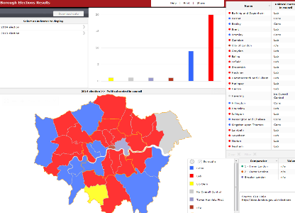
Borough Council Election Results 2014
- data.ubdc.ac.uk
- data.europa.eu
pdf, xlsUpdated Nov 8, 2023+ more versionsShareFacebookTwitterEmailClick to copy linkLink copiedCiteGreater London Authority (2023). Borough Council Election Results 2014 [Dataset]. https://data.ubdc.ac.uk/dataset/borough-council-election-results-2014xls, pdfAvailable download formatsDataset updatedNov 8, 2023Dataset provided byGreater London AuthorityDescription
This report includes a great deal of detail on every aspect of the 2014 London Borough council general elections. No other single volume presents the full results and election statistics from the 32 London boroughs enabling the reader to analyse and compare the results across London in one place. The report presents data for every candidate in every ward (excluding the City of London which operates on a different electoral model). The report also contains analysis of the European election results for London that took place on the same day.
Printed Copies
After much discussion, we are now able to accept orders for hard copies £30, but please note there is a minimum number of orders we must receive before it can be sent to print. Click here for further details.
Details of all previous elections reports in the series can be found here.
Summary results of the 2014 local elections in London, showing number and percentage of seats won, turnout and political control.
Final 2014 ward results
These results show the number of votes for each candidate in each ward in London. Turnout, number of ballots, postal votes, and breakdown of rejected votes, Mayoral and European voting figures are also included where available.
Map showing political control in each ward.
https://londondatastore-upload.s3.amazonaws.com/images/London-ward-map-borough-election-2014-new-colours-small.png" alt="">
Also, using these ward results, Oliver O'Brien from CASA has created some eye catching interactive ward maps.
The borough map shows the summary results in both the 2010 and 2014 elections.
The ward interactive map shows the detailed results for each candidate at ward level for the last three elections between 2006 and 2014.

This motion chart shows the relationship, between share of votes and seats won by the major parties in elections since 1964 at borough level (requires Adobe Flash Player).
 )
) London Atmospheric Emissions Inventory (LAEI) 2016
- data.subak.org
pdf, zipUpdated Feb 15, 2023ShareFacebookTwitterEmailClick to copy linkLink copiedCiteGreater London Authority (2023). London Atmospheric Emissions Inventory (LAEI) 2016 [Dataset]. https://data.subak.org/dataset/london-atmospheric-emissions-inventory-laei-2016zip, pdfAvailable download formatsDataset updatedFeb 15, 2023Area coveredLondonDescriptionThe LAEI 2016 has been superseded. Click here for the full list of releases.
Emissions estimates of key pollutants (NOx, PM10, PM2.5 and CO2) by source type are included for the base year 2016. Emissions for previous years 2010 and 2013 have also been recalculated, using the latest data sources (emission factors, activity data, ...) and methodology.
Emissions projected forward to 2020, 2025, and 2030 will be available soon.
The area covered by the LAEI includes Greater London (the 32 London boroughs and the City of London), as well as areas outside Greater London up to the M25 motorway.
These emissions have been used to estimate ground level concentrations of key pollutants NOx, NO2, PM10 and PM2.5 across Greater London for year 2016, using an atmospheric dispersion model. Air pollutant concentration maps and associated datasets are available for download.
Due to the size of the LAEI database, datasets have been zipped and need to be downloaded in several parts.
UPDATE 03/07/19 - The concentration maps and associated data (including population and school exposure data) have been reissued following a minor issue with the previous dataset. Please read the following note for further information: Updated LAEI 2016 Concentration Maps and Associated Data - July 2019 (.PDF - 146kB).
Documentation
- LAEI 2016 Methodology document (.PDF - 2.8MB)
- Regional Background Concentrations Update (.PDF - 646.3KB)
Supporting Information Key GIS geographies and road traffic flows and vehicle-kilometres for 2010, 2013 and 2016 for each vehicle type. Data are provided in Excel and GIS formats.
- Supporting Information - GIS geographies (.ZIP - 31.8MB)
- Supporting Information - Road Traffic Data - Excel (.ZIP - 211.9MB)
- Supporting Information - Road Traffic Data - GIS (.ZIP - 45.5MB)
Grid Emissions Summary This dataset includes emissions of NOx, PM10, PM2.5 and CO2in tonnes/year for 2010, 2013 and 2016 for each source category at a 1km grid square resolution, including summary tables for London boroughs and London zones (Central / Inner / Outer London). Data are provided in Excel and GIS formats.
- Emissions - Data - Excel Files (.ZIP - 20.9MB)
- Emissions - Data - GIS Files (.ZIP - 18.1MB)
- Emissions - Summary Dashboards (.ZIP - 41 KB)
- Emissions – Data – Excel files – Other pollutants (.ZIP - 4.7 MB)
Detailed Road Transport Road transport emissions in 2010, 2013 and 2016 by vehicle type and also by pollutant. This data is presented at link level for major roads and at grid level for minor roads and cold start emissions. Data are provided in Excel and GIS formats.
- Emissions - Detailed Road Transport - Major Roads - Excel (.ZIP - 340.2KB)
- Emissions - Detailed Road Transport - Minor Roads & Cold Start - Excel (.ZIP - 25.8KB)
- Emissions - Detailed Road Transport - GIS (.ZIP - 436.9KB)
Concentrations This dataset includes modelled 2016 ground level concentrations of annual mean NOx, NO2, PM10 and PM2.5 in µg/m3 (microgramme per cubic metre) at 20m grid resolution. For PM10, it also includes the number of daily means exceeding 50 µg/m3.Data are provided in Excel, GIS and PDF formats.
- Concentrations - Data - ASCII Files (.ZIP - 86.4MB)
- Concentrations - Data - Excel Files (.ZIP - 139.2MB)
- Concentrations - Maps - PDF Files (.ZIP - 10.9MB). Update 03/04/19 - Note that the map of PM 2.5 annual mean concentrations for 2016 has been added to the zip file.
- Concentrations - Data - GIS Files (.ZIP - 126.4MB). Includes GIS files in ESRI format to visualise the concentrations in a GIS software (ArcGIS).
Population Exposure This dataset includes estimations of the number of Londoners and number of schools in London exposed to an annual average NO2 concentration above the Air Quality Strategy objective of 40µg/m3, based on the modelled 2016 ground level concentrations. A comparison with previous 2013 concentrations modelled for the LAEI 2013 inventory is also provided.
- NO2 Population Exposure (.XLSX - 25KB)
- NO2 and PM2.5 School Exposure (.XLSX - 269KB)
- s
Local Authority Districts, Counties and Unitary Authorities (April 2021) Map...
- geoportal.statistics.gov.uk
- hub.arcgis.com
Updated Oct 8, 2021+ more versionsShareFacebookTwitterEmailClick to copy linkLink copiedCiteOffice for National Statistics (2021). Local Authority Districts, Counties and Unitary Authorities (April 2021) Map in the UK [Dataset]. https://geoportal.statistics.gov.uk/documents/66b816fda5cd44e5a4ff5c38dcfa2777Dataset updatedOct 8, 2021Dataset authored and provided byOffice for National StatisticsLicensehttps://www.ons.gov.uk/methodology/geography/licenceshttps://www.ons.gov.uk/methodology/geography/licences
Area coveredDescriptionA PDF map that shows the local authority districts, counties and unitary authorities in the United Kingdom as at April 2021. The map has been created to show the United Kingdom from country level down to local authority district level. (File Size - 1,969 KB)
FacebookTwitterHave you ever wanted to create a quick thematic map of London but lacked the GIS skills or software to do it yourself?
These free mapping tools from the GLA Intelligence Unit allows the user to input their own data to create an instant map that can be copied over into Word or another application of your choice. The user can also copy over the legend, and add labels.
The template allows the user to select either 4 or 5 ranges, and it even has a function to change the colours on the map (default colours are blue).
The tool now also allows users to input their own ranges, which will override the automatic ranges.
There is:
Standard borough thematic map
Borough thematic map for categories (as opposed to numbers).
And ward maps for individual boroughs see list below.
Copyright notice: If you publish these maps, a copyright notice must be included within the report saying: "Contains Ordnance Survey data © Crown copyright and database rights."
Ward maps
Ward mapping tools for each borough have also been created. Select the borough you require from the list below:
All London Wards map with pre-2014 boundaries
Barking and Dagenham, Barnet, Bexley, Brent, Bromley, Camden, Croydon, Ealing, Enfield, Greenwich, Hackney (pre 2014), Hammersmith and Fulham, Haringey, Harrow, Havering, Hillingdon, Hounslow, Islington, Kensington and Chelsea (pre 2014), Kingston upon Thames, Lambeth, Lewisham, Merton, Newham, Redbridge, Richmond upon Thames, Southwark, Sutton, Tower Hamlets (pre 2014), Waltham Forest, Wandsworth, Westminster
New ward boundaries - came into effect from May 2014
All London wards map 2014 including the new ward boundaries for Hackney, Kensington and Chelsea, and Tower Hamlets following changes in May 2014.
Hackney, Kensington and Chelsea, Tower Hamlets
https://londondatastore-upload.s3.amazonaws.com/london-excel-map-thumb.JPG" alt="Alt text">
NOTE: Excel 2003 users must 'ungroup' the map for it to work.
Full instructions are contained within the spreadsheet. If you have any questions about these tools please contact Gareth Piggott.
Macros
The tool works in any version of Excel. But the user MUST ENABLE MACROS, for the features to work. There a some restrictions on functionality in the ward maps in Excel 2003 and earlier - full instructions are included in the spreadsheet.
To check whether the macros are enabled in Excel 2003 click Tools, Macro, Security and change the setting to Medium. Then you have to re-start Excel for the changes to take effect. When Excel starts up a prompt will ask if you want to enable macros - click yes.
In Excel 2007 and later, it should be set by default to the correct setting, but if it has been changed, click on the Windows Office button in the top corner, then Excel options (at the bottom), Trust Centre, Trust Centre Settings, and make sure it is set to 'Disable all macros with notification'. Then when you open the spreadsheet, a prompt labelled 'Options' will appear at the top for you to enable macros.
To create your own thematic borough maps in Excel using the ward map tool as a starting point, read these instructions. You will need to be a confident Excel user, and have access to your boundaries as a picture file from elsewhere. The mapping tools created here are all fully open access with no passwords.