- N
Cohen's d Confidence Sets Results: Algorithm 1 UpperConfidenceInterval c05
- neurovault.org
niftiUpdated Oct 19, 2020+ more versions Share
Share Facebook
 Twitter
 EmailClick to copy linkLink copiedCite(2020). Cohen's d Confidence Sets Results: Algorithm 1 UpperConfidenceInterval c05 [Dataset]. http://identifiers.org/neurovault.image:426879niftiAvailable download formatsUnique identifierhttps://identifiers.org/neurovault.image:426879Dataset updatedOct 19, 2020License
CC0 1.0 Universal Public Domain Dedicationhttps://creativecommons.org/publicdomain/zero/1.0/
License information was derived automaticallyDescriptionUpper confidence interval!
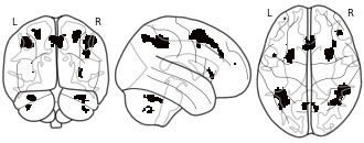
Collection description
In this repository, we share all of the Human Connectome Project results maps used in the manuscript Spatial
Confidence Sets for Standardized Effect Size Images
(Bowring, Telschow, Schwartzman, Nichols; 2020).Images are named using the following format: The 'Algorithm 1 LowerConfidenceInterval c05' image is the (blue) lower CS map obtained for the targetted Cohen's d effect size c = 0.5 using Algorithm. 1 as described in the manuscript; the 'Algorithm 3 MiddleConfidenceInterval c12' image is the (yellow) point estimate map obtained for the targetted Cohen's d effect size c = 1.2 using Algorithm. 3. etc.
Finally, the 'SnPM filtered' image is the thresholded (p < 0.05 FWE; obtained via permutation) statistical results map from applying a group-level one sample t-test to the 80 subjects' data.
Subject species
homo sapiens
Map type
R
- f
Figures S1 to S10: A data-driven approach to understanding the relations...
- geolsoc.figshare.com
zipUpdated Oct 15, 2025ShareFacebookTwitterEmailClick to copy linkLink copiedCiteYu-Ting Yu; H. Sebnem Duzgun; Andrew Sabin (2025). Figures S1 to S10: A data-driven approach to understanding the relations between geothermal exploration parameters: insights from Coso, Brady and Desert Peak, USA [Dataset]. http://doi.org/10.6084/m9.figshare.30366421.v1zipAvailable download formatsUnique identifierhttps://doi.org/10.6084/m9.figshare.30366421.v1Dataset updatedOct 15, 2025Dataset provided byGeological Society of LondonAuthorsYu-Ting Yu; H. Sebnem Duzgun; Andrew SabinLicenseAttribution 4.0 (CC BY 4.0)https://creativecommons.org/licenses/by/4.0/
License information was derived automaticallyDescriptionFigure S1. Illustration of indicator mineral map datasets. Figure S2. Illustration of fault map datasets. Figure S3. Fault system at CGF. Figure S4. Fault system at BGF and DPGF. Figure S5. Illustration of LST datasets. Figure S6. Histograms and CDF plots of Two-Class Mineral Maps versus Fault Distance Maps. Figure S7. Histograms and CDF plots of Two-Class Mineral Maps versus Fault Density Maps. Figure S8. Histograms and CDF plots of Two-class Temperature Maps versus fault datasets. The top two rows correspond to Fault Distance Maps, while the bottom two rows correspond to Fault Density Maps. Figure S9. Histograms and CDF plots of Two-Class Mineral Maps versus Multiclass Temperature Map. Figure S10. The multiple comparisons of ANOVA. The plots show the mean estimates (circles) and 95% confidence intervals (bars) for each group of SGP. Red symbols highlight groups with Significant Differences from the control group (blue). Grey symbols indicate groups with Insignificant Differences where confidence intervals overlap with the control group.
- f
Regions with chlorophyll 2 concentrations, as defined by 95% confidence...
- data.apps.fao.org
Updated Jun 30, 2024ShareFacebookTwitterEmailClick to copy linkLink copiedCite(2024). Regions with chlorophyll 2 concentrations, as defined by 95% confidence intervals, greater than 0.5 mg/m3 that were combined for the months available in each hemisphere for the blue mussel [Dataset]. https://data.apps.fao.org/map/catalog/srv/resources/datasets/34e73ea7-d62e-403c-9217-826cc2c314b5Dataset updatedJun 30, 2024DescriptionThis dataset identifies all regions in which the full 95% confidence interval is greater than 0.5 mg/m3 that were combined for the months available in each hemisphere for the blue mussel. The chlorophyll 2 data includes the mean chlorophyll 2 level per month, the standard deviation and the number of observations used to calculate the mean. Based on these values, the 95% upper and lower confidence levels about the mean for each month have been generated.
- f
Regions with sea surface temperatures, as defined by 95% confidence...
- data.apps.fao.org
Updated Nov 11, 2023+ more versionsShareFacebookTwitterEmailClick to copy linkLink copiedCite(2023). Regions with sea surface temperatures, as defined by 95% confidence intervals, between 4 and 16 �C over entire year [Dataset]. https://data.apps.fao.org/map/catalog/components/search?keyword=Sea%20surface%20temperatureDataset updatedNov 11, 2023DescriptionThis dataset identifies all regions in which the full 95% confidence interval is between 4 and 16 �C for all 12 months. The sea surface temperature data includes the mean sea surface temperature per month, the standard deviation and the number of observations used to calculate the mean. Based on these values, the 95% upper and lower confidence levels about the mean for each month have been generated.
- f
Locations of FeGC QTL detected by composite interval mapping analysis from...
- datasetcatalog.nlm.nih.gov
- figshare.com
Updated Feb 20, 2013ShareFacebookTwitterEmailClick to copy linkLink copiedCiteKochian, Leon V.; Glahn, Raymond P.; Rutzke, Michael A.; Szalma, Stephen J.; Hoekenga, Owen A.; Mwaniki, Angela M.; Lung'aho, Mercy G.; Hart, Jonathan J. (2013). Locations of FeGC QTL detected by composite interval mapping analysis from summary trait data. [Dataset]. https://datasetcatalog.nlm.nih.gov/dataset?q=0001717411Dataset updatedFeb 20, 2013AuthorsKochian, Leon V.; Glahn, Raymond P.; Rutzke, Michael A.; Szalma, Stephen J.; Hoekenga, Owen A.; Mwaniki, Angela M.; Lung'aho, Mercy G.; Hart, Jonathan J.DescriptionBLUPs were estimated from the analysis of variance and used as summaries for quantitative trait locus detection by composite interval mapping. Confidence intervals (CI) for each QTL are reported at two different confidence values. Genetic locations refer to IBM v1 map coordinates. Positive values for the additive effect denote B73 provided the superior allele. Multiple Interval Mapping (MIM) was used to estimate the 3-factor model.
- g
Data used to model and map arsenic concentration exceedances in private...
- gimi9.com
Updated Mar 12, 2021+ more versionsShareFacebookTwitterEmailClick to copy linkLink copiedCite(2021). Data used to model and map arsenic concentration exceedances in private wells throughout the conterminous United States for human health studies | gimi9.com [Dataset]. https://gimi9.com/dataset/data-gov_data-used-to-model-and-map-arsenic-concentration-exceedances-in-private-wells-throughout-t/Dataset updatedMar 12, 2021Area coveredContiguous United States, United StatesDescriptionThis data release contains data used to develop models and maps that estimate probabilities of exceeding various thresholds of arsenic concentrations in private domestic wells throughout the conterminous United States. Three boosted regression tree (BRT) models were developed separately to estimate the probability of private well arsenic concentrations exceeding 1, 5, and 10 micrograms per liter (µg/L). A random forest (RF) model was developed to estimate the most probable arsenic concentration category (≤5, >5 to ≤10, or >10 µg/L). The models use arsenic concentration data from private domestic wells located throughout the conterminous United States and independent variables that are available as geospatial data. The models were used to produce maps that are included in this data release. The model input data (predictor variables) that were used to make the maps are within a zipped folder (Map_Input_Data.zip) that contains 85 tif-raster files, one for each model predictor variable. The map probability estimates that are outputs from the model are in a zipped folder (Map_Output_Data.zip) that contains 13 tif-raster files, one model estimate map for each of the BRT models and four for the RF model, as well as 2 confidence interval maps for each BRT model.
NOAA Office for Coastal Management Sea Level Rise Data: Mapping Confidence
- catalog.data.gov
- datasets.ai
- +2more
Updated Oct 31, 2024+ more versionsShareFacebookTwitterEmailClick to copy linkLink copiedCiteNOAA Office for Coastal Management (Point of Contact, Custodian) (2024). NOAA Office for Coastal Management Sea Level Rise Data: Mapping Confidence [Dataset]. https://catalog.data.gov/dataset/noaa-office-for-coastal-management-sea-level-rise-data-mapping-confidence3Dataset updatedOct 31, 2024DescriptionThese data were created as part of the National Oceanic and Atmospheric Administration Office for Coastal Management's efforts to create an online mapping viewer depicting potential sea level rise and its associated impacts on the nation's coastal areas. The purpose of the mapping viewer is to provide coastal managers and scientists with a preliminary look at sea level rise (slr) and coastal flooding impacts. The viewer is a screening-level tool that uses nationally consistent data sets and analyses. Data and maps provided can be used at several scales to help gauge trends and prioritize actions for different scenarios. The Sea Level Rise and Coastal Flooding Impacts Viewer may be accessed at: https://www.coast.noaa.gov/slr These data depict the mapping confidence of the associated Sea Level Rise inundation data, for the sea level rise amount specified. Areas that have a low degree of confidence, or high uncertainty, represent locations that may be mapped correctly (either as inundated or dry) less than 8 out of 10 times. Areas that have a high degree of confidence, or low uncertainty, represent locations that will be correctly mapped (either as inundated or dry) more than 8 out of 10 times or that there is an 80 percent degree of confidence that these areas are correctly mapped. Areas mapped as dry (no inundation) with a high confidence or low uncertainty are coded as 0. Areas mapped as dry or wet with a low confidence or high uncertainty are coded as 1. Areas mapped as wet (inundation) with a high confidence or low uncertainty are coded as 2. The NOAA Office for Coastal Management has tentatively adopted an 80 percent rank (as either inundated or not inundated) as the zone of relative confidence. The use of 80 percent has no special significance but is a commonly used rule of thumb measure to describe economic systems (Epstein and Axtell, 1996). In short, the method includes the uncertainty in the lidar derived elevation data (root mean square error, or RMSE) and the uncertainty in the modeled tidal surface from the NOAA VDATUM model (RMSE). This uncertainty is combined and mapped to show that the inundation depicted in this data is not really a hard line, but rather a zone with greater and lesser chances of getting wet. For a detailed description of the confidence level and its computation, please see the Mapping Inundation Uncertainty document available at: https://coast.noaa.gov/data/digitalcoast/pdf/mapping-inundation-uncertainty.pdf
Construction of consensus map for barley in this study.
- plos.figshare.com
xlsxUpdated May 20, 2024ShareFacebookTwitterEmailClick to copy linkLink copiedCiteBinbin Du; Jia Wu; Qingming Wang; Chaoyue Sun; Genlou Sun; Jie Zhou; Lei Zhang; Qingsong Xiong; Xifeng Ren; Baowei Lu (2024). Construction of consensus map for barley in this study. [Dataset]. http://doi.org/10.1371/journal.pone.0303751.s003xlsxAvailable download formatsUnique identifierhttps://doi.org/10.1371/journal.pone.0303751.s003Dataset updatedMay 20, 2024AuthorsBinbin Du; Jia Wu; Qingming Wang; Chaoyue Sun; Genlou Sun; Jie Zhou; Lei Zhang; Qingsong Xiong; Xifeng Ren; Baowei LuLicenseAttribution 4.0 (CC BY 4.0)https://creativecommons.org/licenses/by/4.0/
License information was derived automaticallyDescriptionConstruction of consensus map for barley in this study.
- N
Spatial confidence sets for raw effect size images: LowerConfidenceInterval...
- neurovault.org
niftiUpdated Oct 20, 2020+ more versionsShareFacebookTwitterEmailClick to copy linkLink copiedCite(2020). Spatial confidence sets for raw effect size images: LowerConfidenceInterval c1500 [Dataset]. http://identifiers.org/neurovault.image:426953niftiAvailable download formatsUnique identifierhttps://identifiers.org/neurovault.image:426953Dataset updatedOct 20, 2020LicenseCC0 1.0 Universal Public Domain Dedicationhttps://creativecommons.org/publicdomain/zero/1.0/
License information was derived automaticallyDescriptionLower confidence interval!
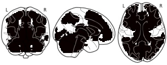
Collection description
In this repository, we share all of the Human Connectome Project results maps used in the manuscript Spatial Confidence Sets for Raw Effect Size Images (Bowring, Telschow, Schwartzman, Nichols; NeuroImage 2019).
Images are named using the following format: The 'LowerConfidenceInterval c1000' image is the (blue) lower CS map obtained for the targetted effect size c = 1.0% BOLD; the 'MiddleConfidenceInterval c1500' image is the (yellow) point estimate map obtained for the targetted effect size c = 1.5% BOLD, etc. Finally, the 'SnPM filtered' image is the thresholded (p < 0.05 FWE; obtained via permutation) statistical results map from applying a group-level one sample t-test to the 80 subjects' data.
Subject species
homo sapiens
Map type
R
- d
Average Confidence Level of Heat Demand Estimates (500m Grid) - Scotland
- dtechtive.com
- ckan.publishing.service.gov.uk
html, tifUpdated Mar 27, 2024+ more versionsShareFacebookTwitterEmailClick to copy linkLink copiedCiteScottish Government (2024). Average Confidence Level of Heat Demand Estimates (500m Grid) - Scotland [Dataset]. https://dtechtive.com/datasets/40068tif(null MB), html(null MB)Available download formatsDataset updatedMar 27, 2024Dataset provided byScottish GovernmentLicensehttps://inspire.ec.europa.eu/metadata-codelist/LimitationsOnPublicAccess/noLimitationshttps://inspire.ec.europa.eu/metadata-codelist/LimitationsOnPublicAccess/noLimitations
Area coveredScotlandDescriptionThe Scotland Heat Map provides estimates of heat demand for all properties in Scotland. To indicate reliability, each estimate is assigned a confidence level from 1 to 5. Level 1 is least reliable and level 5 most. This is mainly determined by the presence of information that would directly impact on heat demand in the estimate's source data. For example, estimates based on data that includes building type, age and floor area would be more reliable than estimates based solely on floor area derived from mapping data. This raster dataset gives the average (mean) confidence level of properties within 500m x 500m grid squares covering all of Scotland. The Scotland Heat Map is a tool to help plan for the reduction of carbon emissions from heat in buildings. Average confidence level is an indicator of reliability of the heat demand estimates within an area and allows planners to decide whether they meet their needs. The map is produced by the Scottish Government. The most recent version is the Scotland Heat Map 2022, which was released to local authorities in November 2023. More information can be found in the documentation available on the Scottish Government website: https://www.gov.scot/publications/scotland-heat-map-documents/
Geospatial data for the Vegetation Mapping Inventory Project of Virgin...
- catalog.data.gov
- gimi9.com
Updated Nov 25, 2025+ more versionsShareFacebookTwitterEmailClick to copy linkLink copiedCiteNational Park Service (2025). Geospatial data for the Vegetation Mapping Inventory Project of Virgin Islands National Park [Dataset]. https://catalog.data.gov/dataset/geospatial-data-for-the-vegetation-mapping-inventory-project-of-virgin-islands-national-paDataset updatedNov 25, 2025Area coveredU.S. Virgin IslandsDescriptionThe files linked to this reference are the geospatial data created as part of the completion of the baseline vegetation inventory project for the NPS park unit. Current format is ArcGIS file geodatabase but older formats may exist as shapefiles. In 2009, the National Park Service (NPS) Vegetation Mapping Inventory funded the NPS South Florida Caribbean Network (SFCN) to evaluate the accuracy of a vegetation map produced by the University of the Virgin Islands (UVI) Eastern Caribbean Center, Conservation Data Center for Virgin Island National Park (VIIS). The UVI vegetation map of VIIS was completed in 2001 and was based on aerial imagery from 1994. VIIS park staff felt that the UVI vegetation map was relatively accurate, but recognized that no formal accuracy assessment of the product had occurred at the time of its creation. Both the UVI and SFCN vegetation maps of VIIS relied on aerial imagery and photo-interpreters to delineate vegetation communities. However, the SFCN vegetation map had the benefit of having LiDAR data available; a technology and data source not readily available when the UVI vegetation map was produced. In addition, the SFCN vegetation map benefited from technological advances in aerial image acquisition that significantly improved the quality and resolution of imagery used; GPS that allowed precise spatial location determination; and GIS science that permitted the viewing, layering, and manipulation of multiple data sources simultaneously. The SFCN vegetation map also benefitted from the use of digital orthophotographs that take into account the surface elevation, topography, of the earth and camera tilt. The UVI vegetation map has an estimated map accuracy of 45.9% with a lower 90th Percentile Confidence Interval of 38.5% while the SFCN vegetation map accuracy is estimated at 87.9% with a lower 90th Percentile Confidence Interval of 82.0%. The SFCN vegetation map has approximately 2.1 times more detail, in the form of individual patches, than the UVI vegetation map does, 1,430 vs 686 patches, respectively. Mean patch size and maximum patch size are smaller in the SFCN vegetation map than in the UVI vegetation map. This results in the SFCN vegetation map being less homogeneous than the UVI map even though the total number of community types mapped are nearly identical, 27 vs 29.
Genetic distance and number of markers for consensus map.
- plos.figshare.com
xlsxUpdated May 20, 2024ShareFacebookTwitterEmailClick to copy linkLink copiedCiteBinbin Du; Jia Wu; Qingming Wang; Chaoyue Sun; Genlou Sun; Jie Zhou; Lei Zhang; Qingsong Xiong; Xifeng Ren; Baowei Lu (2024). Genetic distance and number of markers for consensus map. [Dataset]. http://doi.org/10.1371/journal.pone.0303751.s004xlsxAvailable download formatsUnique identifierhttps://doi.org/10.1371/journal.pone.0303751.s004Dataset updatedMay 20, 2024AuthorsBinbin Du; Jia Wu; Qingming Wang; Chaoyue Sun; Genlou Sun; Jie Zhou; Lei Zhang; Qingsong Xiong; Xifeng Ren; Baowei LuLicenseAttribution 4.0 (CC BY 4.0)https://creativecommons.org/licenses/by/4.0/
License information was derived automaticallyDescriptionGenetic distance and number of markers for consensus map.
- D
Source code for "Comparative Study on the Perception of Direction in...
- darus.uni-stuttgart.de
Updated May 26, 2023ShareFacebookTwitterEmailClick to copy linkLink copiedCiteAlexandra Hirsch; Max Franke; Steffen Koch (2023). Source code for "Comparative Study on the Perception of Direction in Animated Map Transitions Using Different Map Projections" [Dataset]. http://doi.org/10.18419/DARUS-3540CroissantCroissant is a format for machine-learning datasets. Learn more about this at mlcommons.org/croissant.Unique identifierhttps://doi.org/10.18419/DARUS-3540Dataset updatedMay 26, 2023Dataset provided byDaRUSAuthorsAlexandra Hirsch; Max Franke; Steffen KochLicensehttps://spdx.org/licenses/MIT.htmlhttps://spdx.org/licenses/MIT.html
Dataset funded byDFGDescriptionThis repository contains the source code related to an OSF pre-registration for an online study. The goal of the study was to evaluate how well participants can determine the geographical direction of an animated map transition. In our between-subject online study, each of three groups is shown map transitions in one map projection: Mercator, azimuthal equidistant projection, or two-point equidistant projection. The distances of the start and end point are varied. Map transitions zoom out and pan towards the middle point, then zoom in and continue panning, following the recommendations by Van Wijk and Nuij (IEEE InfoVis, 2003). We measure response time and accuracy in the task. We evaluate the results by the sample means per participant, using interval estimation with 95% confidence intervals. We construct the confidence intervals by using BCa bootstrapping. This repository contains the entire code for the study. The various folders also contain README Markdown files that explain the components and how they are to be used. The npm and Python version dependencies are listed below under Research Software Metadata, the versions of package dependencies are provided via the lockfiles (stimuliCreation/package.json, online-study/package.json, and online-study-flask-server-main/pyproject.toml). The folders are: assignment/: Python script to randomly distribute and assign the stimuli to participants. dataAnalysis/: R code to evaluate the collected data for the study. evaluation/: Python code to extract and pre-process the study results of individual participants. The result of the preprocessing step are collected CSV files, which are then evaluated by the R code in the dataAnalysis/ folder. online-study/: React JavaScript sources and assets for the web front-end of the study. online-study-flask-server-main/: Flask server hosting the study content and managing the distribution and saving of results. This folder also contains a compiled version of the React frontend from the online-study/ folder. stimuliCreation/: JavaScript and HTML code for the web page that generates and downloads the individual video stimulus frames and metadata.
Geospatial data for the Vegetation Mapping Inventory Project of San Juan...
- catalog.data.gov
- datasets.ai
Updated Nov 25, 2025ShareFacebookTwitterEmailClick to copy linkLink copiedCiteNational Park Service (2025). Geospatial data for the Vegetation Mapping Inventory Project of San Juan Island National Historical Park [Dataset]. https://catalog.data.gov/dataset/geospatial-data-for-the-vegetation-mapping-inventory-project-of-san-juan-island-national-hDataset updatedNov 25, 2025Area coveredSan Juan IslandDescriptionThe files linked to this reference are the geospatial data created as part of the completion of the baseline vegetation inventory project for the NPS park unit. Current format is ArcGIS file geodatabase but older formats may exist as shapefiles. Prior to conducting field visits, existing vegetation maps, soils maps, wetland locations, and 2007 NAIP 6-inch color orthophotos, provided by the NPS, were used to delineate preliminary polygons using ArcGIS™ 9.3.1. Each polygon was assigned a "GIS_Poly" code. Some areas were difficult to map without field verification. A total of 544 polygons were mapped in the park. Vegetation classified at the Alliance-level was mapped correctly with an overall accuracy of 82.0 ± 5.2% (90% confidence intervals) and increases at higher NVC levels to 86.8%± 4.6% at the Division-level. Twenty-three of 32 Alliances in the AA (72%) meet the user‘s accuracy requirement of 80% established by the National Park Service Vegetation Inventory Program.
- d
Geospatial data for the Vegetation Mapping Inventory Project of Mount...
- datasets.ai
- catalog.data.gov
57Updated May 31, 2023ShareFacebookTwitterEmailClick to copy linkLink copiedCiteDepartment of the Interior (2023). Geospatial data for the Vegetation Mapping Inventory Project of Mount Rushmore National Memorial [Dataset]. https://datasets.ai/datasets/geospatial-data-for-the-vegetation-mapping-inventory-project-of-mount-rushmore-national-me57Available download formatsDataset updatedMay 31, 2023Dataset authored and provided byDepartment of the InteriorDescriptionThe files linked to this reference are the geospatial data created as part of the completion of the baseline vegetation inventory project for the NPS park unit. Current format is ArcGIS file geodatabase but older formats may exist as shapefiles.
The vegetation map was developed by photographic interpretation of 1993, 1:16,000 scale color infrared photography. Two separate classification systems were used to develop the mapping units. Cultural, disturbed, or unsampled vegetation types used the Anderson Level II classification system. All other vegetation within the mapping boundary used map units derived from the NVCS. A total of 8 Anderson Level II classes and 9 NVCS classes were used. The NVCS classes were combined to form 4 vegetation mapping classes. As part of the mapping effort, we have included an accuracy assessment for the overall mapping effort as well as for individual class accuracies. These data include reporting for both errors of omission and commission. Overall map accuracy is 74.3% within a 90% confidence interval. All digital files were created with a standard format. All files are delivered with a UTM projection, zone 13, and a north American datum of 1983.
- a
2015 Aerial Map
- data-roseville.opendata.arcgis.com
Updated Mar 28, 2019+ more versionsShareFacebookTwitterEmailClick to copy linkLink copiedCiteCityofRoseville (2019). 2015 Aerial Map [Dataset]. https://data-roseville.opendata.arcgis.com/maps/44b809712f2f4b458abd4a7a4daa3e4aDataset updatedMar 28, 2019Dataset authored and provided byCityofRosevilleArea coveredDescriptionFlown in March 2015. Data compiled to meet or exceed a horizontal accuracy of +/- 2 feet RMSE or 3.46 feet at a 95% confidence level according to the NSSDA standard necessary for 1”=200’ maps.
Access the Data:
Access the REST Service from https://ags.roseville.ca.us/arcgis/rest/services/PublicServices/. View the data in our Historical Imagery Collection.Add data to ArcMap or ArcPro by clicking on “View Metadata” and selecting “Open in ArcGIS Desktop”.
- f
Model predicted early preeclampsia detection rate (95% CI) for FPR of 10%...
- datasetcatalog.nlm.nih.gov
- plos.figshare.com
Updated May 29, 2014ShareFacebookTwitterEmailClick to copy linkLink copiedCiteDane, Adrie D.; Schielen, Peter C. J. I.; Berger, Ruud; Harms, Amy C.; Vreeken, Rob J.; Pennings, Jeroen L. A.; Koster, Maria P. H.; Visser, Gerard H. A.; Kuc, Sylwia; Hankemeier, Thomas (2014). Model predicted early preeclampsia detection rate (95% CI) for FPR of 10% with prior risk, MAP, taurine, asparagine and glycylglycine in control and preeclampsia groups. [Dataset]. https://datasetcatalog.nlm.nih.gov/dataset?q=0001169159Dataset updatedMay 29, 2014AuthorsDane, Adrie D.; Schielen, Peter C. J. I.; Berger, Ruud; Harms, Amy C.; Vreeken, Rob J.; Pennings, Jeroen L. A.; Koster, Maria P. H.; Visser, Gerard H. A.; Kuc, Sylwia; Hankemeier, ThomasDescriptionDR: detection rate; FPR: false positive rate; MAP: Mean Arterial Pressure; CI: confidence interval; AUC: area under curve, EO-PE: early-onset preeclampsia; LO-PE: late-onset preeclampsia.*The best model selected for further validation.
- f
S1 File -
- figshare.com
xlsxUpdated May 20, 2024+ more versionsShareFacebookTwitterEmailClick to copy linkLink copiedCiteBinbin Du; Jia Wu; Qingming Wang; Chaoyue Sun; Genlou Sun; Jie Zhou; Lei Zhang; Qingsong Xiong; Xifeng Ren; Baowei Lu (2024). S1 File - [Dataset]. http://doi.org/10.1371/journal.pone.0303751.s010xlsxAvailable download formatsUnique identifierhttps://doi.org/10.1371/journal.pone.0303751.s010Dataset updatedMay 20, 2024Dataset provided byPLOS ONEAuthorsBinbin Du; Jia Wu; Qingming Wang; Chaoyue Sun; Genlou Sun; Jie Zhou; Lei Zhang; Qingsong Xiong; Xifeng Ren; Baowei LuLicenseAttribution 4.0 (CC BY 4.0)https://creativecommons.org/licenses/by/4.0/
License information was derived automaticallyDescriptionIncreasing yield is an important goal of barley breeding. In this study, 54 papers published from 2001–2022 on QTL mapping for yield and yield-related traits in barley were collected, which contained 1080 QTLs mapped to the barley high-density consensus map for QTL meta-analysis. These initial QTLs were integrated into 85 meta-QTLs (MQTL) with a mean confidence interval (CI) of 2.76 cM, which was 7.86-fold narrower than the CI of the initial QTL. Among these 85 MQTLs, 68 MQTLs were validated in GWAS studies, and 25 breeder’s MQTLs were screened from them. Seventeen barley orthologs of yield-related genes in rice and maize were identified within the hcMQTL region based on comparative genomics strategy and were presumed to be reliable candidates for controlling yield-related traits. The results of this study provide useful information for molecular marker-assisted breeding and candidate gene mining of yield-related traits in barley.
Heart Disease Mortality Rate by Colorado Census Tract
- data-cdphe.opendata.arcgis.com
Updated Feb 8, 2016+ more versionsShareFacebookTwitterEmailClick to copy linkLink copiedCiteColorado Department of Public Health and Environment (2016). Heart Disease Mortality Rate by Colorado Census Tract [Dataset]. https://data-cdphe.opendata.arcgis.com/items/f1a592eef8384946b0ae64701bece065Dataset updatedFeb 8, 2016Dataset authored and provided byColorado Department of Public Health and Environmenthttps://cdphe.colorado.gov/Area coveredDescriptionPurpose:This dataset contains the Age-Adjusted Heart Disease Mortality Rate Per 100,000 Persons by Colorado Census Tract; Underlying Cause of Death Heart Disease (2019-2023). Numerator data are calculated from the 2019-2023 Colorado Department of Public Health and Environment Colorado Death Statistics. Population estimates for the denominator are calculated from the 2019-2023 U.S. Census American Community Survey. This dataset supports the CDPHE Community Health Equity Map application.Update Schedule and URL: This dataset is updated annually (September) and is provided using death data directly assembled from the Colorado Department of Public Health and Environment Colorado Death Statistics. For inquiries about vital statistics or for data requests contact cdphe.healthstatistics@state.co.us, or use the data request system. Fields Description:GEOID: 11-digit Census Tract FIPS Identifier COUNTY: County NameNAME: Census Tract NameHD_ADJRATE: Age-Adjusted Heart Disease Mortality Rate Per 100,000 Persons (2019-2023, Colorado Death Statistics and U.S. Census American Community Survey)HD_L95CI: Heart Disease Mortality Rate Lower 95% Confidence IntervalHD_U95CI: Heart Disease Mortality Rate Upper 95% Confidence IntervalHD_STATEADJRATE: Statewide Age-Adjusted Heart Disease Mortality Rate Per 100,000 Persons (2019-2023, Colorado Death Statistics and U.S. Census American Community Survey)HD_SL95CI: Statewide Heart Disease Mortality Rate Lower 95% Confidence IntervalHD_SU95CI: Statewide Heart Disease Mortality Rate Upper 95% Confidence IntervalHD_DISPLAY: Heart Disease Mortality Rate Census Tract Map Display Designation (Estimate is Higher Than State Average Confidence Interval, Lower Than State Average Confidence Interval, Not Different Than State Average Confidence Interval, No Events or Data Suppressed)
- w
Soil Organic Carbon Stock Maps for Belgium: mean (40 m grid)
- soilwise-he.containers.wur.nl
- dov.vlaanderen.be
- +2more
Updated Nov 9, 2024+ more versionsShareFacebookTwitterEmailClick to copy linkLink copiedCite(2024). Soil Organic Carbon Stock Maps for Belgium: mean (40 m grid) [Dataset]. https://soilwise-he.containers.wur.nl/cat/collections/metadata:main/items/bf8c35ad-ab45-4084-b1e1-3042c66204aaDataset updatedNov 9, 2024Area coveredBelgiumDescriptionThe Belgian soil organic carbon (SOC) stock map for topsoils (0-30 cm) at the resolution of 40m x 40m was composed of 2 regional SOC stock maps. For the regional maps a different approach was used for agricultural land as compared to forest. The maps are based on digital soil mapping approaches using empirical models calibrated to predict the SOC stock and using covariates that are available at a sufficient resolution at the regional scale. All maps are strongly dependent on the Belgian Soil Map (texture and drainage parameters). The regional maps were compiled at a fine resolution (10m x 10m grid cells for Flanders and 40m x 40m grid cells for Wallonia). Next they were joined (40m x 40m grid cells). The regional maps for Flanders were scaled up tot the 40m x 40m grid of Wallonia.
Given the different origin of the individual maps, the uncertainty varies between maps. For instance, a map of the 90% confidence interval of the SOC stocks was produced for agricultural soils in Wallonia based on a Monte Carlo Approach taking into account both the measurement and the model uncertainties. For Flemish forest soils, spatial and analytical uncertainties were taken into account using bootstrapping techniques. For Flemish agricultural soils, the uncertainty reported is the model uncertainty on point estimates for each data point, in which the estimated model parameters are simulated 1000 times as being independent normal distributed variables using their model estimation and standard error as distribution parameters. No additional uncertainty is taken into account for the conversion functions that use the stochastic variables "bulk density". The metadata are available and allow assessing the uncertainties of the stock estimates in the different component maps. The SOC stock map (resolution of 40m x 40m) is the first comprehensive map for Belgium integrating grasslands, croplands and forests. Based on this map another SOC stock map at a resolution of 1km x 1km in the coordinate reference system WGS84 was created.
FacebookTwitterCC0 1.0 Universal Public Domain Dedicationhttps://creativecommons.org/publicdomain/zero/1.0/
License information was derived automatically
Upper confidence interval!
Collection description
In this repository, we share all of the Human Connectome Project results maps used in the manuscript Spatial
Confidence Sets for Standardized Effect Size Images
(Bowring, Telschow, Schwartzman, Nichols; 2020).
Images are named using the following format: The 'Algorithm 1 LowerConfidenceInterval c05' image is the (blue) lower CS map obtained for the targetted Cohen's d effect size c = 0.5 using Algorithm. 1 as described in the manuscript; the 'Algorithm 3 MiddleConfidenceInterval c12' image is the (yellow) point estimate map obtained for the targetted Cohen's d effect size c = 1.2 using Algorithm. 3. etc.
Finally, the 'SnPM filtered' image is the thresholded (p < 0.05 FWE; obtained via permutation) statistical results map from applying a group-level one sample t-test to the 80 subjects' data.
Subject species
homo sapiens
Map type
R